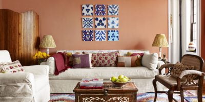
They say what goes around comes around. And what goes out of style is due for a serious come-uppance — especially when it comes to home design and decor, where what was fashionable yesterday can fall out of favour tomorrow if you’re not paying attention.
“To keep your living spaces fresh and lively, it’s important to appraise and edit your environment,” says interior designer Lois C. Esformes, of Beverly Hills, Calif. “You are in control of your home’s environment, so it makes sense to add in elements that are inspiring and joyful and cut objects or colours that no longer work.”
Trouble is, it can be tricky to know what hues, fabrics, textures and styles are considered outdated and which can make your interiors appear horribly out of step. That’s where home improvement shows, online resources like Pinterest and Houzz, and outside expertise can help.
“It’s not feasible for most people to completely redo their homes to keep up with every trend, but an experienced interior designer can help you create a classic and timeless look or incorporate the best of what the current trends are,” says Genevieve Wilhelm, designer with Lee Douglas Interiors in Lincoln, Neb.
To help steer away from the wrong direction, and point you toward a better path, here are six interior design drifts now considered outmoded — and six alternative ideas now in vogue:
Faux finish painting
Sponging and wall striping were all the rage years ago, but today “wall striping makes the room look smaller and feel confined, and dipping a sponge in paint and going over the top of a wall colour has gone the way of the Dodo,” says Jody Finglas, president of Westchester, N.Y.-based Finglas Painting.
Alternative idea: Lighter solid paint colours for walls, ceilings and trim.
“It’s not unusual to see a room today painted completely white, where accents of colour can be encouraged in fabrics, furnishings and accessories,” Finglas says.
Reclaimed wood furniture/pieces
“This trend has been overdone, giving a home too much of a farmhouse or industrial feel,” says Gina Gutierrez, founder/lead designer of San Francisco-headquartered Gina Rachelle Design. “People have also taken it too far by using it in too many ways — on walls, ceiling beams, furniture and art accents.”
Alternative idea: Try acquiring custom furniture/decor from a local woodworking firm or artisan, “and pick a modern or timeless style instead of imitation mid-century,” recommends John Linden, designer with MirrorCoop in Los Angeles.
Heavy metal solos
A room replete with too much of any single particular metallic finish in the hardware, decor and/or lighting is a no-no, “creating a style that can seem overdone and cheap,” says Gutierrez; this is especially verboten if the choices are passé like brushed nickel or polished brass.
Alternative idea: “Replace un-mellow yellow like polished brass with moody, black finishes, antique finishes with a patina or soft matte finishes,” says Maureen Baker, designer at Mancini Duffy in New York City. Also, “don’t be afraid to mix metals appropriately, mixing warm and cool tones and keeping in mind that black goes with everything,” Gutierrez advises.
Industrial lighting
“Industrial chic has hit a plateau, and while Edison bulbs provided a nice visual alternative, their mediocre light output and too-warm temperature couldn’t give them staying power,” Baker says.
Alternative idea: “Midcentury modern and retro style light fixtures are now replacing the industrial trend,” Wilhelm says. “Simple and clean lines in classic styles are trending in lighting nowadays.”
Single-colour painted rooms
“Monochromatic walls throughout multiple rooms can be drab,” Esformes says.
Alternative idea: Wallpaper and paint. “Wallpapers are back. But instead of wallpapering everything with reckless abandon, try papering a few high-impact walls with an interesting print and finish the rest of the walls with a complementary paint or gloss,” Esformes says, suggesting a metallic wallpaper adjacent to a matte grey wall as an example.
Chevron patterns
The zigzag style seemed omnipresent for a while — in drapes, pillows, wallpaper, you name it. But many experts say this up-and-down motif is on its way down.
Alternative idea: “Trellis patterns have been gaining in popularity and convey a more classic and timeless look; you can see it appearing in more wallpaper prints and backsplash patterns today,” Wilhelm says.
[“Source-thechronicleherald”]


